MCGRIFF INSURANCE
The employees struggled with inefficient processes, particularly around gathering client information, submitting to carriers, and creating proposals. The existing tools were inadequate, leading to a lack of standardization, frustration, and decreased productivity. We were asked to modernize and innovate their platform through the development of a Broker Portal.
Designing a non-existent portal that would improve user workflows by addressing existing inefficiencies.
Figma, Miro
UX Designer (responsible for research, visual design, and interaction design)
Strategist (supported in workshops, interviews and led research)
UX Principal (provided overall guidance)
Myself, UX Designer (led the design work and supported in research) During the research phase, I collaborated closely with the team, and in production, I worked directly with stakeholders and the UX Principal.
8 months
We conducted interviews with 10 stakeholders from McGriff to uncover their challenges, goals, and frustrations with the current process. Key themes from the interviews included frustrations with manual processes, difficulties with technology integration, and the need for a more efficient and streamlined experience.
In our initial research phase, we uncovered that every stakeholder we spoke to struggled with their current tools—ImageRight and Sagitta. While powerful, these systems were overly complex, filled with redundant fields, lacked customization, and ultimately slowed users down. Many described spending more time navigating the tools than actually serving clients.
Because of this, most users developed their own workarounds. Each stakeholder had a slightly different process, often bypassing the main systems altogether in favor of Excel. This led to fragmented workflows, siloed information, and data that was easily lost or inaccessible to others.
In essence, complexity had driven fragmentation. The insurance space is inherently multifaceted—diverse clients, diverse products, and diverse needs. But instead of supporting this variety, the tools had multiplied it—fragmenting templates, formats, and processes across teams and offices. The heavy reliance on manual data entry also introduced inefficiencies and increased the potential for errors.
Additional challenges we heard included inconsistent client data collection—making standardization difficult—and carrier proposals returning in multiple formats, which required significant manual reformatting and data re-entry.
We created personas that helped us understand the different user roles and their pain points. We focused on three core personas:
These personas provided us with high-level goals, needs, and behaviors, helping us to tailor the portal experience to the distinct needs of each role.
We created empathy maps to visualize the emotional and functional needs of our personas, diving deep into what they say, think, do, and feel. These helped us synthesize the information gathered from interviews and align with user expectations.
Based on our understanding from the interviews, we also took a shot at creating the journey map with touch points on tools used and how different personas interact with each other.
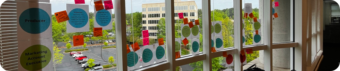
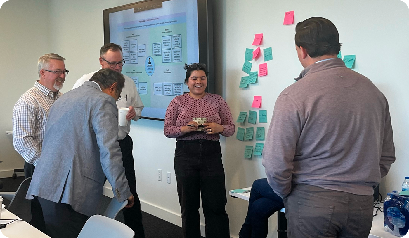
We held a workshop in Georgia, which was instrumental in shaping our strategy for the portal. During this session, we facilitated activities that helped identify pain points, define user journeys, and generate ideas for improvement.
These activities informed the development of features for the portal that would alleviate pain points and enhance the user experience.
The journey flows through three main phases: first, gathering and formatting data for submission; second, marketing that submission to carriers; and finally, building the proposal for the customer. The map outlines each persona and supporting role involved across these phases, along with the key platforms, channels, and documents that come into play.
During our workshop, participants helped refine our understanding of this journey—validating the steps, correcting gaps, and surfacing new pain points.
We found that the data gathering phase was one of the biggest bottlenecks, with delays caused both by inconsistent customer input and inefficient internal processes. In the marketing phase, lack of visibility into carrier activity created further frustration and slowed down progress. Across the entire journey, we saw a recurring theme of manual touch points leading to delays, errors, and duplicate work.

We split the workshop participants into 3 teams, the scenario for each of these were the same, except for the final action:
”John, a 50 year old broker that has been with McGriff through a number of mergers, works in the Arkansas office. His job spans across producer, MAE, and servicer roles. His client is up for renewal soon,
a. and needs to start the process.”
b. and he has done the work gathering quotes from carriers.”
c. and he has done the work in gathering and preparing the info for submission to market.”
These hurdle scenarios cover the different phases of the journey.
From the tallest hurdles we were able to create, how might we questions for the Crazy 8’s.

Our tallest hurdles allowed us to create “How Might We” statements that would generate the thinking for Crazy 8’s.
In the end we had 144 squares of solutions and features to review.
We went through them and starred the strongest and then categorized them.

People were very clear about what they wanted to see, almost universallly was a way to track carrier data, whether it is a centralized updated set of carrier contacts, or a way to display carrier analytics. Automation is the name of the game, almost everyone asked for a way to automate key tasks. We heard they wanted a way to prefill customer infromation in forms and a central place to house all the communication, data, and a place where you sart and end a policy renewal.
Lack of Standardized Processes
Pain Point: Stakeholders were frustrated with the lack of standardized processes and the inefficiency of using multiple tools for data entry, leading to errors and time-consuming manual tasks.
Features that support the Solution:
Fragmented Communication and Inability to Track Submissions
Pain Point: Users struggled with fragmented communication and the inability to track the status of submissions and proposals across different carriers.
Features that support the Solution:
Slow Proposal Processes
Pain Point: The existing tools, like Sagitta, were seen as difficult to use, lacked integration, and caused delays in the proposal process.
Features that support the Solution:
Fun fact: The day before my flight to Georgia, I had my 25th birthday party. During clean up I fell into a trash bin and had to get several stitches (which is why I have that giant bandage on my face)!
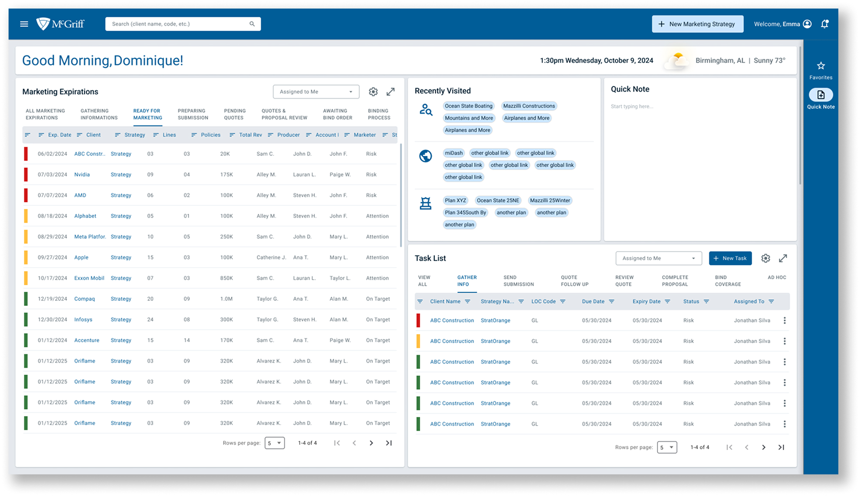
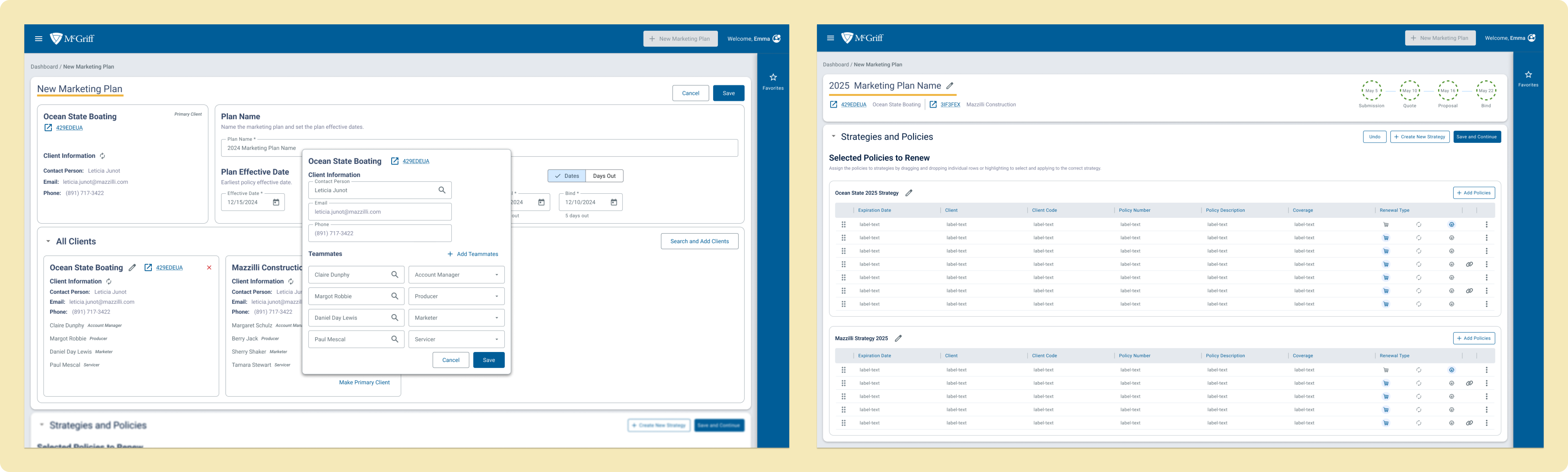
We began by designing the "happy path" for the Broker Portal. This involved outlining the ideal user experience for completing a proposal and submitting it to carriers. We focused on simplifying the process, reducing manual input, and providing users with the tools they need in one place.
The happy path is split into the “180 Day Renewal Start” and “Client Proposal Submission”.

In phase 2, we worked closely with stakeholders and developers to refine and expand the portal's design. We used Azure to track tasks and ensure that each design aligned with the overall project goals. As the design progressed, we continued to iterate based on feedback from stakeholders and devs.
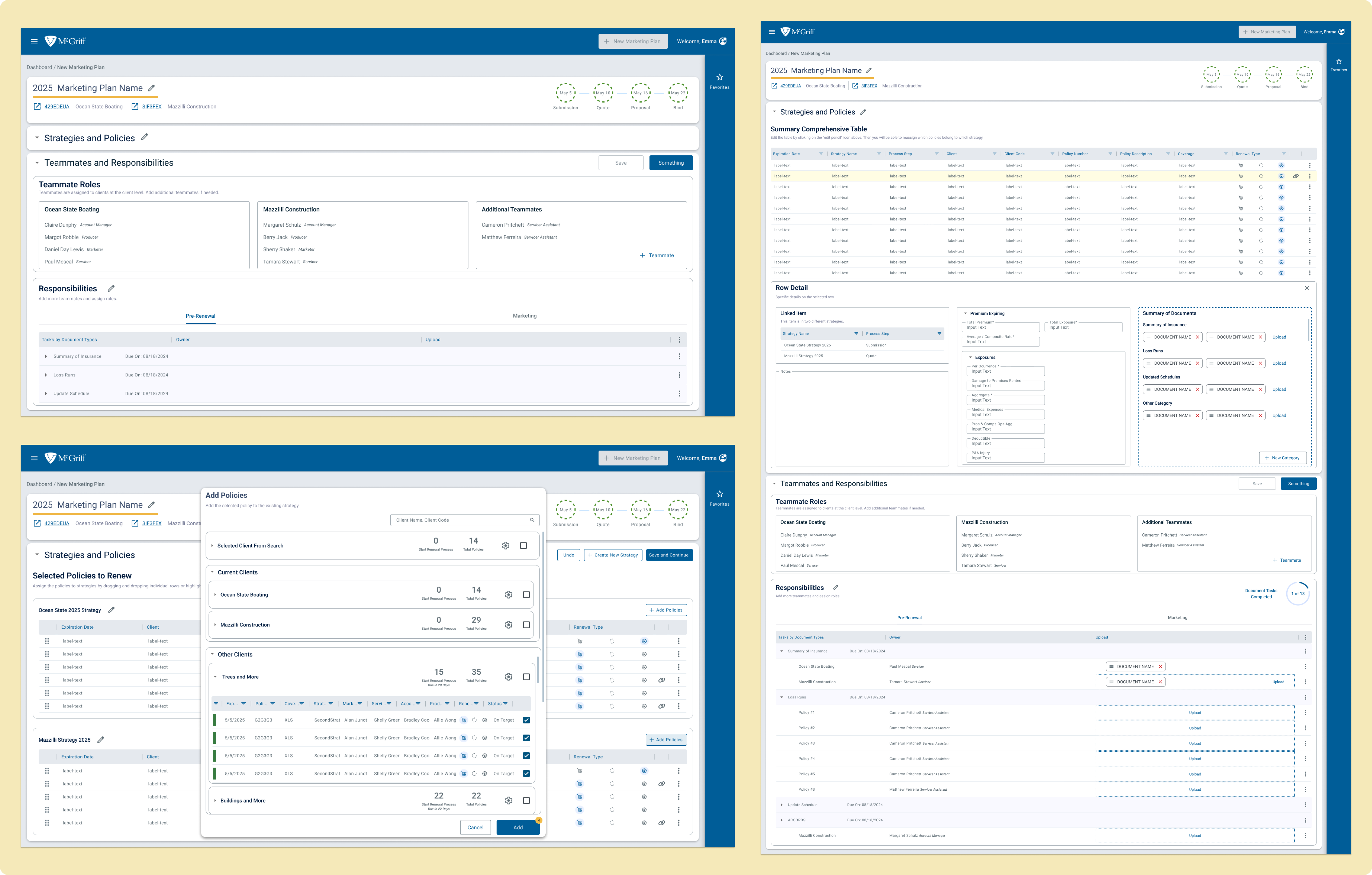
We were able to work closely with McGriff’s UX Design Lead and pass the torch with a mapped-out flow of how the screens and workspaces came together, as well as which screens still needed to be created. The hand-off included the design system and the research done during the eight and a half months, as well as a recording of how the flows of all the screens fit together.
Leadership and Collaboration
Leading conversations with stakeholders helped me gain a better understanding of their pain points and how to translate them into design solutions. I learned how to effectively communicate design ideas and gather feedback that guided the project forward.
Iterative Design Process
The importance of iteration became clear as we moved from low-fidelity sketches to more detailed designs. Working closely with developers and stakeholders in Phase 2 reinforced how design should evolve in collaboration with all team members.
Balancing Stakeholder Needs with User-Centered Design
I learned how to navigate the balance between business requirements and user needs. The challenge was ensuring the portal was both functional for McGriff employees and intuitive for end-users.
Instead of moving directly from the "happy path" to development, I would have regrouped with stakeholders to refine the happy path further, ensuring it fully aligned with their expectations and breaking the project into smaller steps. This would have allowed us to more effectively tackle the next steps and ensure we were aligned on priorities before diving into full development.